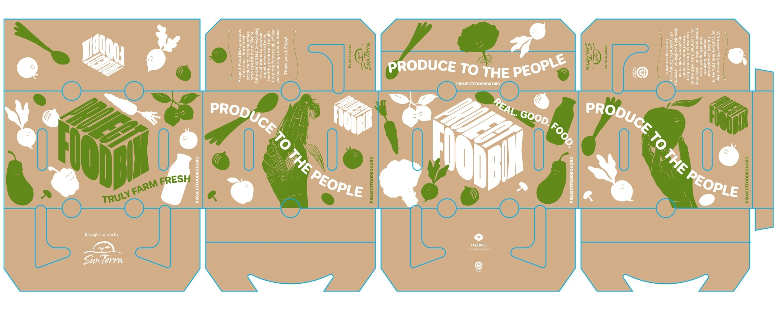
Welcome to the Project FoodBox brand guidelines.
This document is made to outline the visual language of our brand. They’re here to inspire, provide guidance and streamline effectivity without stifling creativity. Enjoy & remember... It’s all in the box!

Mission & Values
Mission
A clear and attainable goal we strive for every day. Our mission statement is a distillation of what we do and how we make our vision a reality.
Our mission is to reduce waste, help stop hunger and make healthy foods accessible to all Americans. Food inequality exists not because there is a shortage of food, but because there is no infrastructure for food banks, community organizations, or healthcare networks to efficiently source and distribute fresh produce... until now. 😃
Positioning
A succinct expression of our core business activity and what sets us apart. This statement helps align marketing efforts with our brand and value proposition.
Project FoodBox sources, packages, and distributes boxes of fresh produce directly from farmers to communities in need. We deliver these nutritious and healthy foods through mission-aligned partners including food banks, faith-based organizations, and most recently- health networks! Project FoodBox was born out of our participation in the USDA’s “Farmers to Families” program which launched in 2020 to offset food insecurity caused by the pandemic. Our mission is to enhance this successful program and continue building an equitable food system for our most vulnerable populations.
Branding Intention
For the Project FoodBox identity system program, we’ve taken a more holistic approach rather than focusing on any singular design element on it’s own. The identity has been crafted with the core values, offerings and purposes of the company in mind. The intention here was to deliver a visual language system that subconsciously directs the viewer towards an inclusive, welcoming and positive emotional space within every interaction of the brand image.
There has always been an interesting, slightly negative connotation towards the world of food banks, the process, the efficiency in which the foods get to the final consumer and of course, the quality of those foods. We wanted to position the company’s niche within this industry in a fresh way, lift the unseen cloud and change people’s perception of this human aid away from the notions of desperation, hardship and turmoil and towards opportunity, family, health and the future. Also, because the parent company SunTerra already has such an excellent reputation as a grower, packer and shipper of fresh, nutritious fruits and vegetables, we wanted to weave the essence and knowledge of that efficiency and proven expertise into the identity of Project FoodBox. By visually and verbally offering a window of transparency into the process from farmer to end consumer, the quality of the foods and the efficacy of the supply chain, we’re able to focus on the numerous different problems within the industry the company is solving.
The identity and communications of the brand are to mirror the actual enhancements Project FoodBox is providing within the industry. Each interaction of the brand from the organic essence of the wordmark, fresh, optimistic color system, relatable caricatures and illustrations or clever activations, all aim to connect with people in a way that is positive, welcoming, fun, trustworthy and overall good.
Values
Core beliefs that shape our internal culture and are expressed to the world. Our values are critical to the existing and future developments of the brand.
Positive | Fresh | Trustworthy
Efficient | Fun | Welcoming
Wordmark
The Wordmark contains a wonderfully balanced duality. It is bold yet organic, natural yet powerful, structured & still free-formed. As the company is reshaping the perception of the industry, we too wanted to take an entirely common concept, like the shape of a box, and give it a completely unique and individual identity to gain attention and stand out in one’s memory – while still remaining relatable.
Instead of thinking outside the box, we’re saying think inside the box. We leaned into the celebration of what the box represents: food, nourishment, shelter, growth, giving, community, love, family. For the brand image, we wanted to personify the box by creating a flexible framework that highlights all the good that is within.
The wordmark has endless flexibility; it can be rotated, stacked, patterned and seen in perspective from various angles and can also be applied in flat color or framed as a window to showcase associated brand imagery. Because the identity will be seen not only in a digital manner but also on physical materials such as the box iteself and collateral goods, we made sure that the wordmark worked extremely well in both print and digital applications. Crafted from a custom extendable typeface, the wordmark is inspired from old letterpress typesettings to give it an organic, authentic feel while still remaining confident and current. Overall, the wordmark was created as the main identifiable asset of the brand to aid in the overarching branding effort towards a fresh, new, inviting and positive outlook on what the company will be doing within the industry.

Taglines
External phrases of language that sum up our brand action & promise in a few memorable words.
Produce to the People.
It’s All in The Box.
Truly Farm Fresh.
Real. Good. Food.
Examples Of Taglines in Use:


Color
Primary palette
“To stand out ahead and not seem overly obvious within the industry, we’ve developed a gripping color system between the primary and secondary colors that stands out as unique and identifiable solely to Project FoodBox.”
Like with all the elements of the brand experience, we want people to see what Project FoodBox is doing in a fresh and positive light. The color system can play beautifully together within all applications while the color psychology speaks of inclusion, warmth, growth, progress and happiness.
 Name: White
CMYK: 0/0/0/0
RGB: 255/255/255
HEX: #FFFFFF
PMS: 663 C
|
 Name: Black
CMYK: 0/0/0/100
RGB: 0/0/0
HEX: #000000
PMS: 419 C
|
 Name: PMS 360 C
CMYK: 45/0/61/25
RGB: 106/191/75
HEX: #6ABF4B
PMS: 360 C
|
Secondary palette
The secondary palette are the supporting colors in our identity.
 Name: PMS 610 C
CMYK: 0/6/62/12 RGB: 225/211/85 HEX: #E1D355 PMS: 610 C |
 Name: PMS 1245 C
CMYK: 0/28/80/16 RGB: 215/154/43 HEX: #D79A2B PMS: 1245 C |
 Name: PMS 1595 C
CMYK: 0/56/90/14 RGB: 219/96/21 HEX: #DB6015 PMS: 1595 C |
|
Name: PMS 200 C
CMYK: 0/99/75/24 RGB: 193/2/48 HEX: #C10230 PMS: 200 C |
Name: PMS 704 C
CMYK: 0/70/70/44 RGB: 142/42/42 HEX: #8E2A2A PMS: 704 C |
Name: PMS 648 C
CMYK: 91/52/0/65 RGB: 83/83/134 HEX: #535386 PMS: 648 C |
|
Name: PMS 5483 C
CMYK: 47/6/0/44 RGB: 75/133/142 HEX: #4B858E PMS: 5483 C |
Name:
PMS 2945 C CMYK: 81/52/0/46 RGB: 26/66/138 HEX: #1A428A PMS: 2945 C |
Name: PMS 3292 C
CMYK: 91/0/13/67 RGB: 84/97/34 HEX: #546122 PMS: 3292 C |
On color

Combinations

 |
 |
Scaling
The wordmark has been carefully crafted to read well atmost sizes. There is no limit at large scale, but be careful at smaller sizes. If legibility is an issue, it’s too small & you should use the brand symbol.
Recommended minimum size is 50 pixels for screen, and 1/2 inch in print.


![]()
Clear space
Don’t crowd the logo. When placing other elements nearby, ensure minimum clear space for brand consistency.
The clear space on any side should be at least the width of the word BOX within the wordmark.


Symbol


Typography
Primary typeface
Halcom Regular is our primary typeface.
A geometric modern sans serif typeface. 16 weights with 550 characters with an alternative lowercase a, g and y, five variations of numerals, manually edited kerning and Opentype features.
|
Halcom Regular |
Halcom Regular
ABCDEFGHIJKLMNOPQRSTUVWXYZ
abcdefghijklmnopqrstuvwxyz
0123456789
!@#$%^&*()?+
|
Weights
Type weight provides hierarchy to distinguish between pieces of information. Use this as a guide for typeface weights employed in our brand.
Jellee Bold
Jellee Bold
Halcom Regular
Halcom Regular
Halcom Regular Italic
Halcom Regular Italic
Halcom Medium
Halcom Medium
Halcom Bold
Halcom Bold Italic
Hierarchy
Size, scale and position all play a factor in how information is read. Always ensure there is a purposeful difference between type sizes. Type sizes are for example only.
Headline
Jellee Bold
80/88pt
Sentence case
Headlines nulla vitae euismod sem. Integer ut vehicula mauris.
Subhead
Halcom Regular
30/36pt
Sentence case
Subheads suspendisse aliquet at dui eu pellentesque. In dui turpis, mollis vel est ullamcorper, bibendum consectetur massa.
Body
Halcom Regular
15/21pt
Sentence case
Body phasellus at ornare mauris, eu viverra tellus. Curabitur sit amet lorem lorem. Praesent vel turpis ex. Pellentesque in felis ante. In massa dolor, porta sed dictum non, gravida et urna. Phasellus imperdiet ligula eu neque blandit, vitae lacinia augue consequat.
Setting type
When setting type, the leading should be consistent across various applications. Leading refers to the space between lines of text.
Leading can be calculated with the following formulas. Type sizes are for example only.
Headline
Jellee Bold
80/88pt
Sentence case
Type size × 1.1 = leading. Headlines at 80pt would have 88pt leading.
Subhead
Halcom Regular
30/36pt
Sentence case
Type size × 1.2 = leading. Subheads at 30pt would have 36pt leading.
Body
Halcom Regular
15/21pt
Sentence case
Type size × 1.4 = leading
Body copy at 15pt would have 21pt leading.
Applications


Business Cards
Please use the following print recommendations:
Size: 2.27 x 3.28 - Finishing to 2.28 x 2.27
Paper A: 130# Environment Cover, Grocer Kraft Raw
Side A: CMYK
Side B: CMYK
Finishing: Diecut
Paper A: 130# Environment Cover, Grocer Kraft Raw
Side A: CMYK Side B: CMYK
Finishing: Diecut


For any questions about using these guidelines, please contact:
Cassidy Brazeel | Program Manager
cassidy@projectfoodbox.org

